“Red Clay and Roses” is about to make its paperback debut. Having existed in ebook form since March, I am told by many people my age and older, (especially my Nursing friends) that they would like to have it in paperback. For that reason, I have this project near completion. I especially would like to hear from people who have read the book or are currently reading it.
There have been challenges to getting this accomplished. Most of these have been overcome and it is almost time to upload the cover image. I have had some cover image issues which I need to speak to you about.
First, when I published in March, I had no clue about the seriousness of publishing. I did not have a blog and most of what I learned, I learned through my independent publisher.
Second, I had not secured a professional cover image artist, and did not know the significance of doing so.
Finally, I knew the story and worked off of what I knew rather than fitting a genre or appealing to an audience. The story has at least three distinctive tragedies described.
That having been said, I will show you the original photo that I worked with for the cover, and tell you why I chose it. I will also show you the evolution of this cover. My daughter and I took a photo of an angelic cherub that someone had placed by a rose bush we had planted in a garden in a public place. Pink roses have an enormous significance in our family as explained in this post. Mother’s Day Memories. We planted the rose bush in remembrance of a lost loved one. In my book, “Red Clay and Roses”, this is explained briefly. I also planted a pink rose bush in memory of a character in my book, beside which, I had placed an angelic cherub, which is also described in the book. Another point about the story has to do with the character, Beatrice, who is haunted by fairy babies and dark angels in an ominous set of delusions and hallucinations. Her husband was an illegal abortionist. Roses are also a repetitive theme throughout the book. Here is the evolution of the cover in picture form: (you can click on these to get a better image in a slideshow of sorts)


“Red Clay and Roses” is a non-fiction novel. It is a faction, if you will, a fictional account of a true story. The setting is a small town, LaGrange, GA, and is very real. The characters in the story, although most of the names were changed, are also very real. The story line is not one that I could change.
Southern fiction is often very cute with Grandma baking biscuits in the oven, and Grandpa sitting on the front porch sipping sweet iced tea while the African American children play together with their white friends in the yard. It is often colored with humor.
“Red Clay and Roses” is not like that at all. It is a story filled with angst and tragedy. It is the reality of the 1950s and 1960s era and the dilemmas faced by people of color and the racial tension they endured. It is a story that examines what life was like before Jim Crow Law was repealed and no longer enforced, the LAWS that PREVENTED blacks and whites from legally mingling publicly in the Old South. It is also a story which describes the reproductive rights and responsibilities of women in a world before Roe Versus Wade. The story is not pretty, not cute, and not humorous. Real life rarely was for many people during that era. For that reason, it is often an untold story. It is one worth remembering.
The book description follows:
“Red Clay and Roses is a fictional account of a true story that speaks to the human condition of life in the Deep South during a time before Jim Crow Law was abolished and Roe vs. Wade. The discovery of an old ledger opens a window into life in a time when women were supposed to keep quiet and serve, abortion was illegal, adoption difficult, and racism rampant. Mystery, rape, murder, drama, and forbidden love meld as the origin of the ledger unfolds.
Althea, a young colored girl, is brutally raped. Althea’s tragedy leaves her family silent and mournful, and her brother, Nathan, looking for answers from a community that is deaf, blind and dumb. Nathan is affected for the rest of his life. A brief summer romance between Nathan and Sybil, an independent, high spirited white woman in the 1950s, leaves more unresolved grief.
Nathan becomes directly involved in the Civil Rights Movement and Sybil is torn between living the mundane life of her peers or a life that involves fastening herself to a taboo relationship. The seeds of prejudice have been sown by a society that seethed with bigotry.”
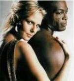
I have had my cover art image criticized for not meeting the expectations of the genre Southern Fiction and was told it should not have a face and it should display something as mundane as a tree on the side of a dirt road. Or it should show a poor black girl in front of a shanty house or some other image that depicts southern poverty.
I have been told also, that the cover would best represent Historical Fiction if there were some way to see the angst of the era on the cover with, for example, an interracial couple in front of a white’s only diner, or a simple picture of the historical restaurant that they frequented in Atlanta.
Here are the images that were suggested to me for “Red Clay and Roses” recently by a Facebook Group: (again, you can click on these to see some of the images better)


So, what are your thoughts? Do I need to invest in another cover image now, before this paperback comes out, or am I good to with the one I have? The Facebook Group used words like: paranormal, horror, comical, unnatural, macabre, haunted, ghoulish, sinister, alarming, frightening, supernatural, eerie and terrifying, to describe my cover image and the feelings it evokes. Again, it is not a pretty story. It is painful, sad and dark. It is a harsh reality story.
I will add here that I want to stand apart from those hundreds of look-alike covers; The romances with the man and woman’s face about to touch, the lonely tree on a dirt road, the poor blacks. I also want to avoid anything that slightly exploits the black race. The whole point to the story is that we are all one human race.


Stand out from the crowd and hold your head up high.
I know I risked displaying a lack of confidence in this post, but I decided to do it anyway, just to get the feedback. I have not fully made up my mind. I want the paperback to be as perfect as possible. It was just one group of women who had not read the book that offered their opinions. I am trying to stay positive, but can’t help feeling a need to explain myself.
Sometimes you need to show vulnerability to get answers. Staying positive is good and always remember you have friends here to fall back on for support and honesty. Only half of us will do the funny ‘let her fall backwards’ trick. We’ll pick you right up after laughing though. Promise. 🙂
You guys are the best 🙂
You know I’ve read the book and my feelings. Stick with what you have – it was a good cover that enticed me to learn more – and once you read the book, people will understand. The other cover possibilities are ho-hum and like too many other books. Stick with what you have is my advice (but I’m a reader, not a writer so you may get better author advice elsewhere)
I like that I have your feedback and you read it as a reader not an author. You are my audience. there is so much advice. I was also advised to have an artist draw an image of black and white children holding hands in a circle if I wanted to convey the image of one human race. I haven’t absolutely discounted that image. Thanks for the input.
Hi Susan,
As you know, I have read and loved your story. I think FB people reacted that way (mostly dark & scary) because of the dark gloomy background. I think your original cover with leaves, and the way the cherub is facing, makes it look less gloomy. Unfortunately, I believe an interracial couple (adult or children) on the cover may turn a group away that may just buy it if it has a different cover, and they read the description. Do you know what I mean?
I would consider a subtitle or note about it being {based on a true story} during a critical era in the American South..
Hope this doesn’t add to the confusion. Not that you are confused…sometimes too many opinions make things harder to decide.
Patti
I thought about the subtitle “A Faction Novel” but I think my cover artist might have difficulty placing it. I loved the cover when I first saw it. I am just concerned about the reader audience being confused.
Honestly, having not read the book (and therefore as someone who would have to rely on it to grab my attention), I like the professional cover you’ve got. I might not be interested in a traditional Southern Fiction story, but this cover makes me curious, so I would go on to the description. Why would you want a cover that evokes a more traditional story if that’s not what you’re offering?
A lonely tree on a dirt road has never made me interested enough to read a book’s description. I say make the cover fit the story, even if it goes against genre expectations.
I can really appreciate your thoughtful comments. I absolutely am looking for a professional cover that makes the reader desire to click on and read the book description. That is paramount. Thank you so very much!
I vote for staying with the original for at least two reasons: 1. You have continuity with what has been previously published. 2. The original image is metaphorical and evokes the South. The controversial themes you discuss under this banner can sensibly cohabit with such a sturdy but beautiful image. That’s what I think anyway.
I like your answer! I have thought it quite beautiful in its own poignant way. I see it as somewhat sad and mischievous the way the fairy babies are in the story.
Although it may not be the best fit, I really like your original image. 🙂 It grabs me and looks much more professional than the alternatives that you showed. You’ve already begun your branding with this image. If much of your audience will come from marketing, I would keep the current cover. It’s really tough for the cover to draw its own audience, say on Amazon, by depicting the genre, especially for certain kinds of books. So a change now carries some risk, especially if the replacement doesn’t really grab that target audience. If things are really slow, there is no harm in trying; otherwise, the risk is worth considering (it may bring rewards, but maybe not). Good luck.
Thanks Chris! I can see their point if they are browsing for something in those specific genres. I really have not had enough sales yet to have a position with Amazon that would promote it through browsing. The other point is that it is a story that is sort of set apart from the traditional ones anyway, so, in that regard it is actually fitting that it be different. If, as some have suggested, the cover is eye catching enough to make them want to click on the book description then it has served its purpose!
I haven’t read the book yet, but I really like the cover as it is.
Thanks for the input. Even without reading the story, I think the cover is interesting enough to make many want to read further. Glad that you like it. 🙂
Hi Susan, I agree with some former comments………..STICK WITH THE ORIGINAL. You really tell a powerful story to bring the reader in,- with a great tale of theSouth .
I think your original cover, the most recent version, is perfect…nancy s,
PS- I also dont like the trite/obvious bookcovers I see on some other books.
But the cherub to me shows vulnerability, almost innocence, and those who read your book will pick up on that.
Thanks nancy. I agree. It seems the general consensus is to stay with the image I have, which does set my mind at ease all things considered. I have just received my notification today to upload the cover image and to prepare another would most certainly result in an unwanted delay.
Novels with a couple on them always make it look like a cheesy erotica novel. No way.
I agree!